Radical Eyes

Visit Website

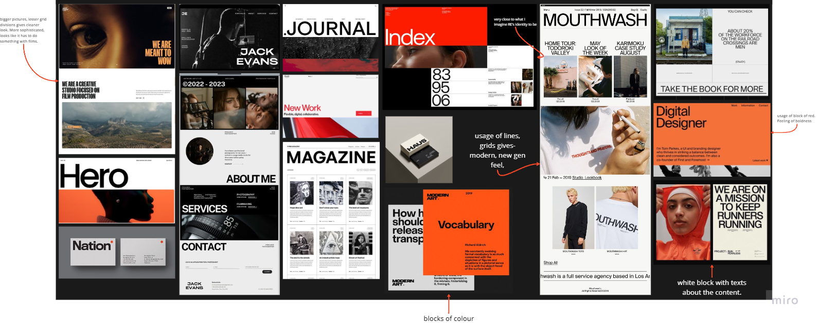
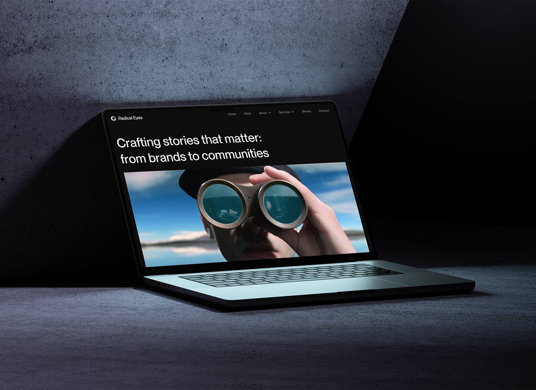
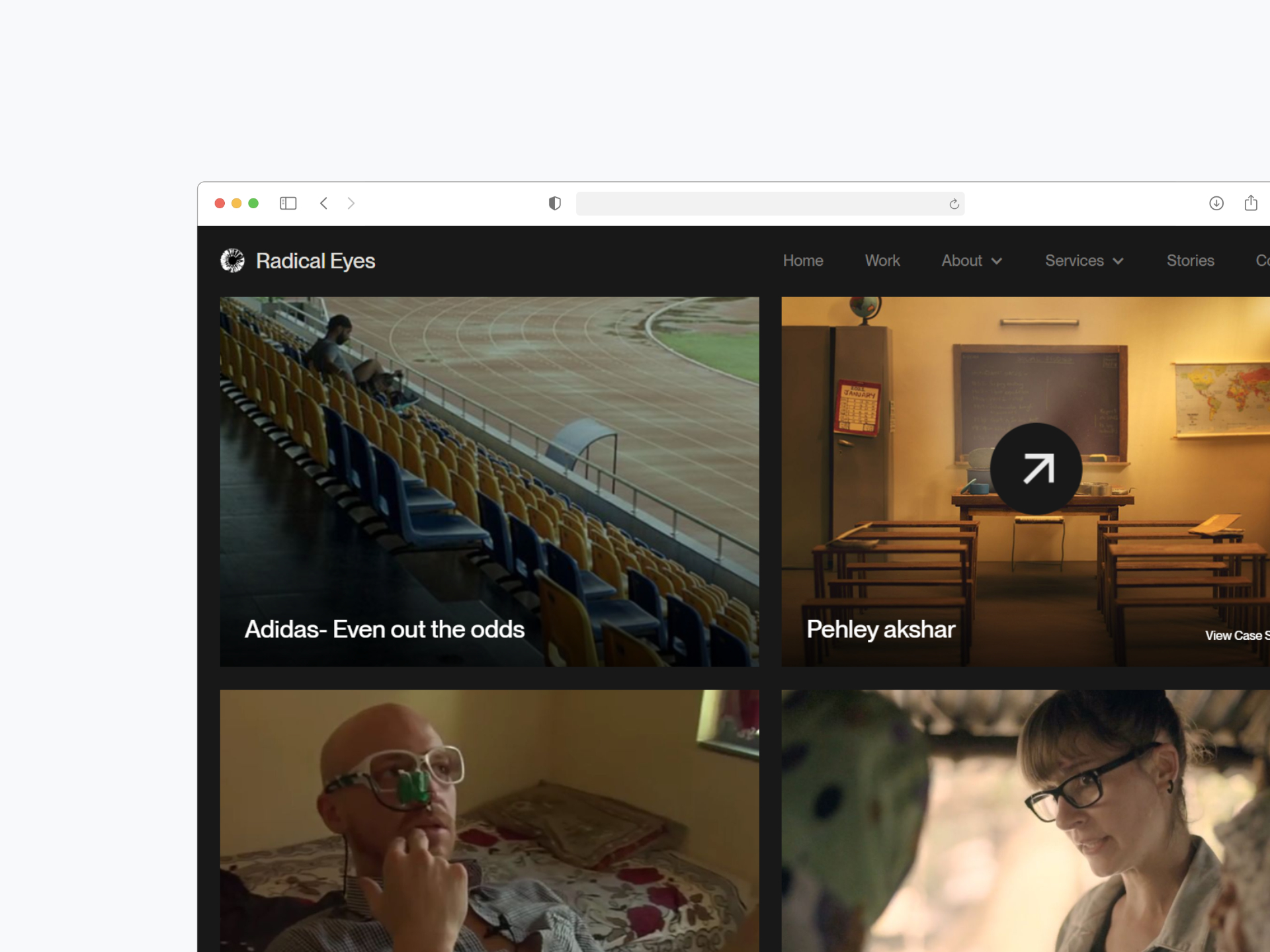
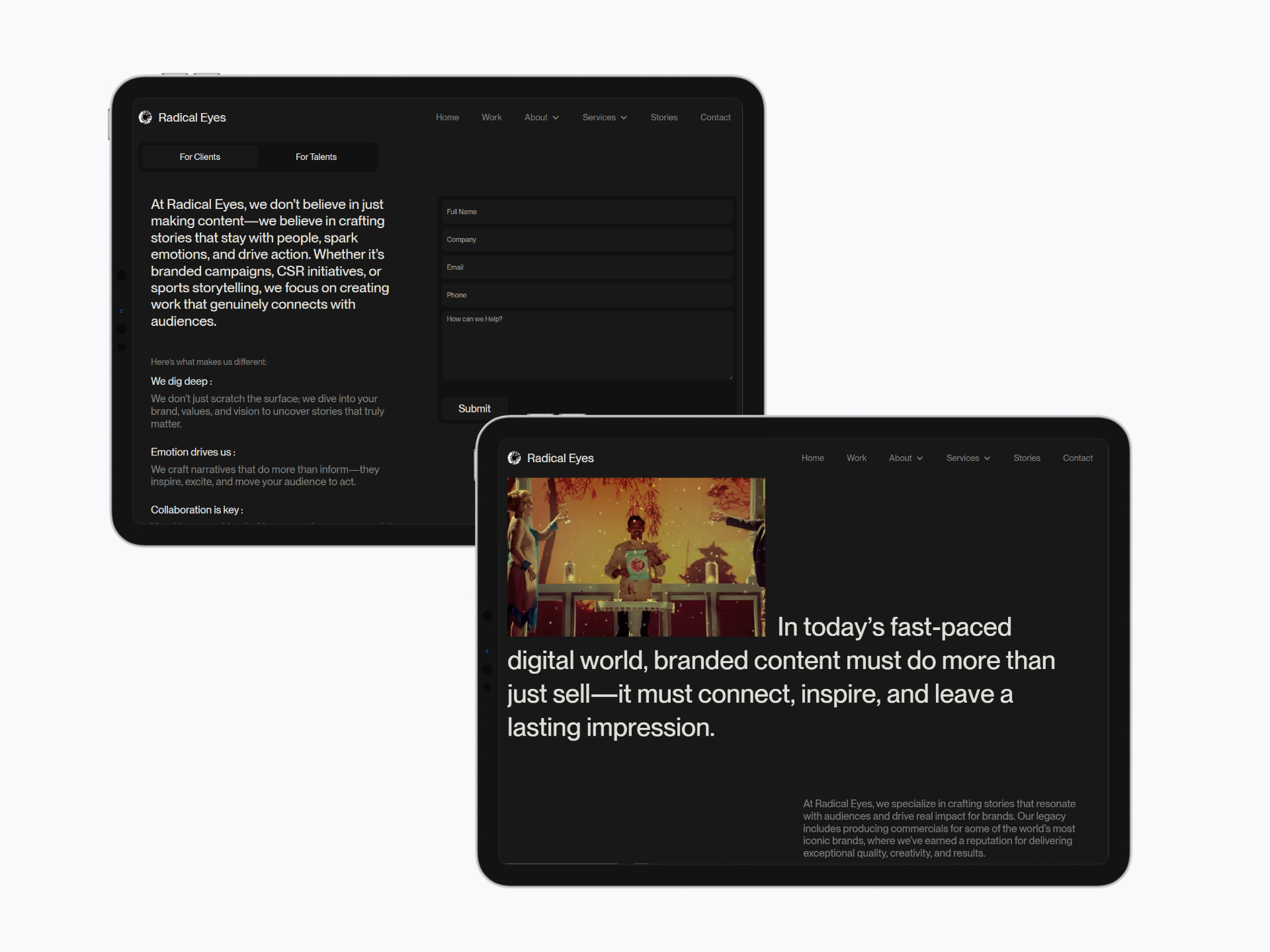
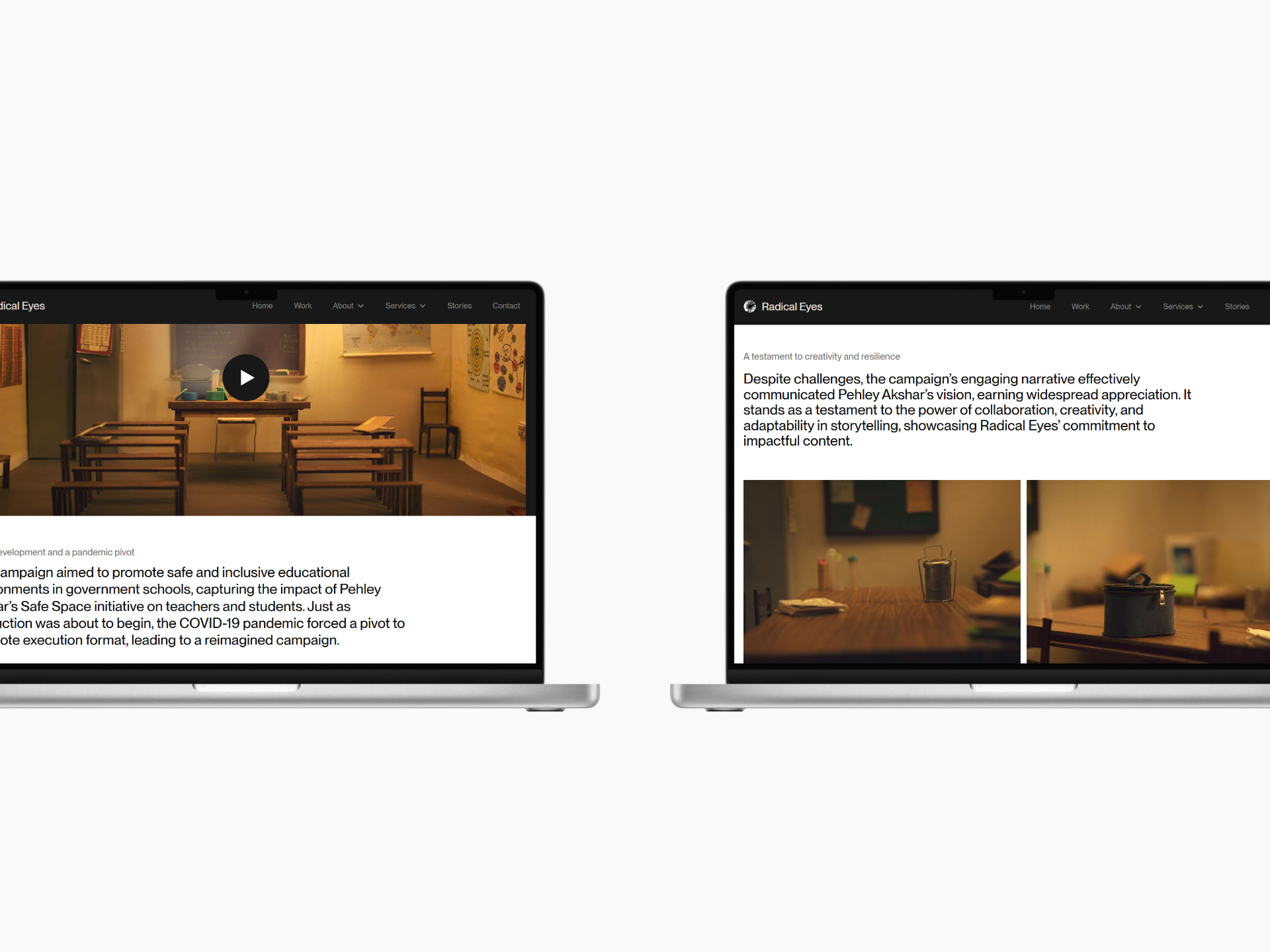
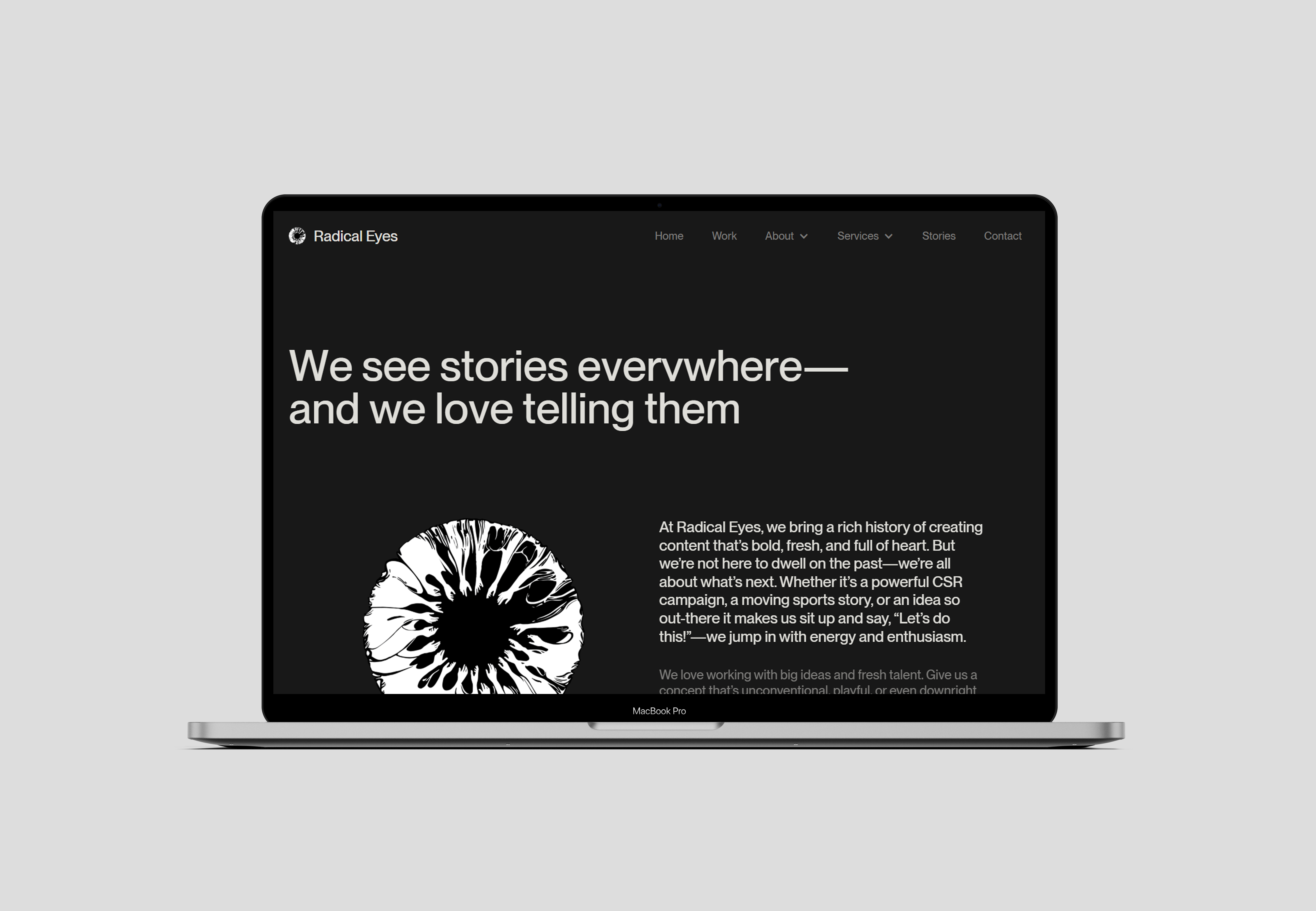
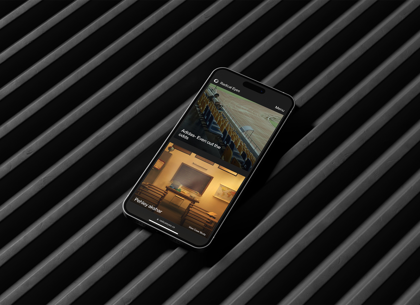
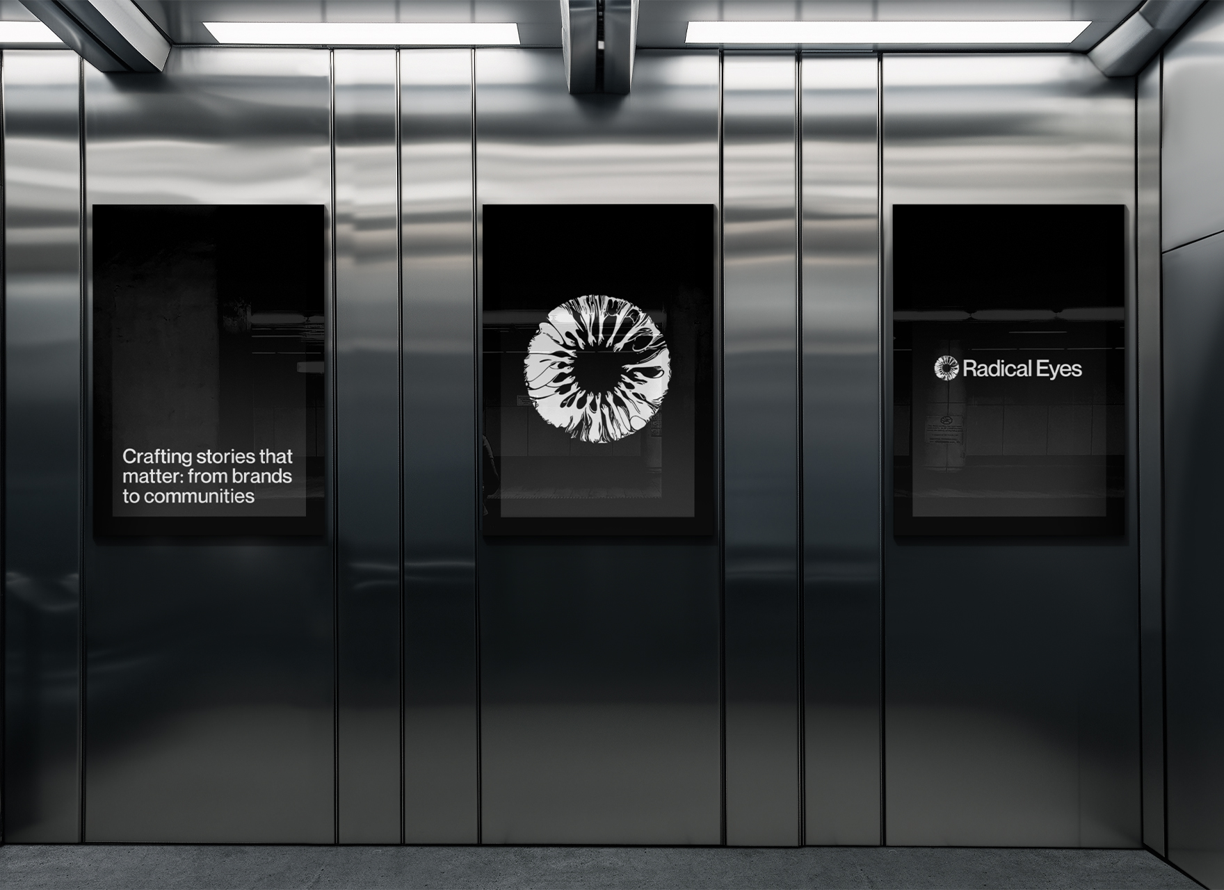
Radical Eyes is a creative production house known for bold, high-impact storytelling across commercials, CSRs, and branded content. Their work screamed avant-garde, but their brand identity? More meh than mind-blowing. So, we stepped in to give them a sharp, modern identity and website that matched their disruptive spirit.

Creative Direction
Logo Design
Brand Collateral
Website Design
Website Development
CMS Architecture

Our goal was to craft a brand identity and website that positioned Radical Eyes as a bold yet thoughtful creative force in both production and CSR.

To achieve this, we focused on:

Striking Visual Presence : Designing a brand that reflects bold creativity and innovation, setting Radical Eyes apart in a competitive industry.

Balance of Edge & Trust : Creating a visual and verbal identity that speaks to both corporate executives seeking reliability and young creatives drawn to fresh, unconventional storytelling.

Global Influence, Local Relevance : Drawing inspiration from international production houses while ensuring the identity resonates within the Indian market.

Fluid, Future-Ready Brand : Building a flexible system that allows Radical Eyes to evolve with industry trends while maintaining its core values of inclusivity and insight.
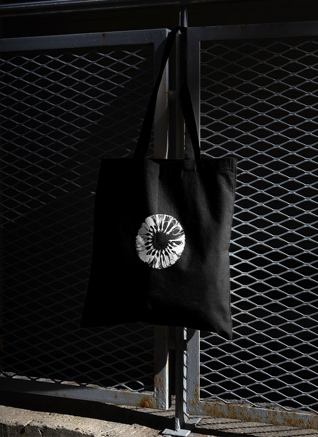
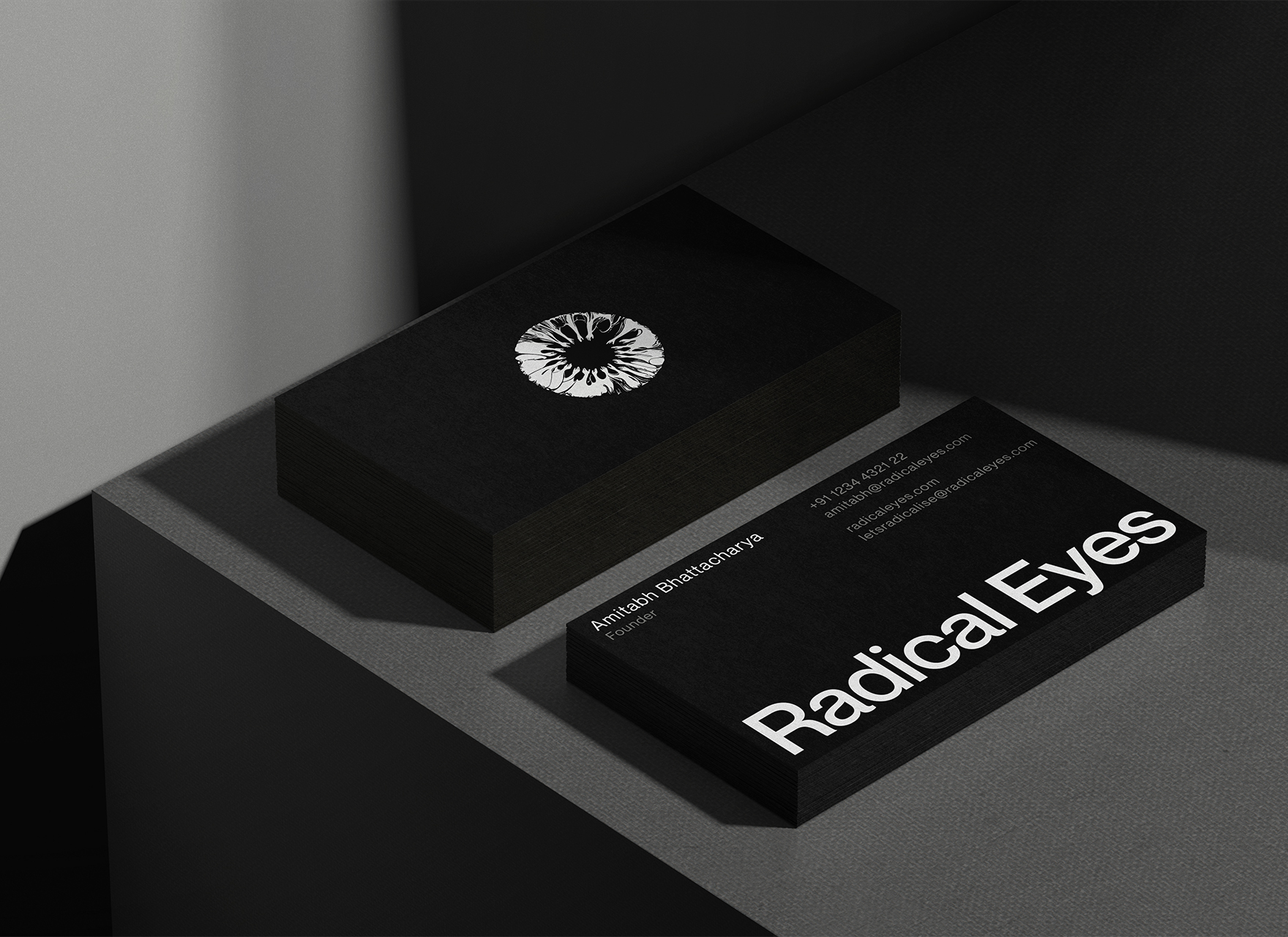
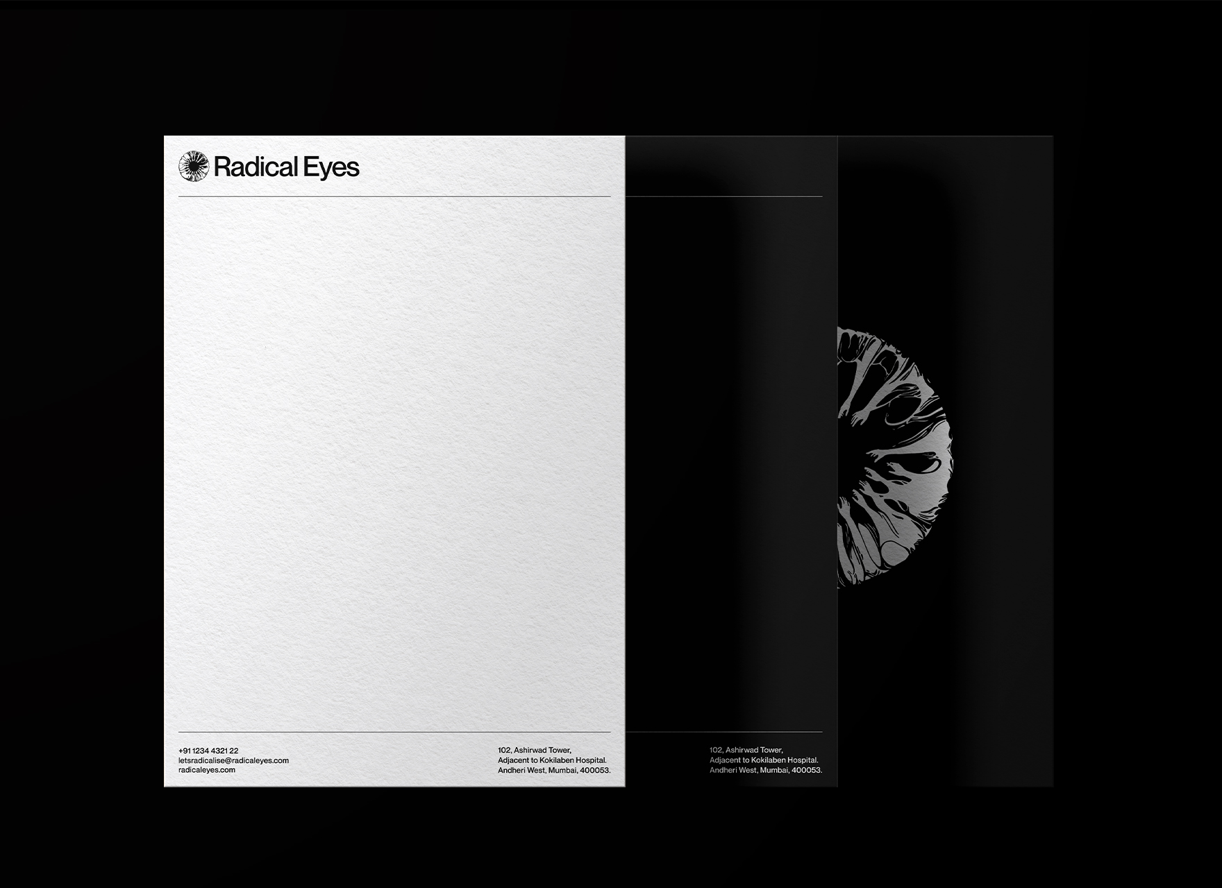
A Story-Driven Identity : The logo needed to be more than a symbol; it had to embody Radical Eyesʼ vision—bold, insightful, and deeply narrative-driven— setting it apart from generic icons or monograms

Image of Amitabh Bhattacharya

Mr. Amitabh Bhattacharya

Founder- Radical Eyes

The Story

Amitabh Bhattacharya - a producer and director behind some of the most iconic brand campaigns we grew up with from Volkswagen, Nissan, Samsung, Thums Up Company among others producing over 300 commercials, contents and features. He’s spent years crafting bold narratives for others, but when it came to his own production house, something felt off.

Radical Eyes was meant to be bold, disruptive, and unapologetically creative, but its brand didn’t match up. It looked like just another production company when, in reality, it was built to challenge the norm—especially in CSR, where storytelling often plays it too safe. Amitabh wanted a brand that felt as sharp as his work, as premium as his clients, and as welcoming as his creative team. More than a logo, he needed an identity that could speak to both high-level corporate executives and fresh creative talent—without losing its edge.So, we stepped in—not just to design a logo, but to build an identity that captured what Radical Eyes truly stood for.

Image of Amitabh Bhattacharya

Initial rough sketch shared with us by Amitabh
showing how he envisioned the logo.

The Logo

Amitabh’s production house originally operated under the name Never-Ending Story, but over time, it no longer felt like the right fit. The brand was evolving, and so was its vision. He wasn’t just looking for a new website—he wanted to completely transform the identity, from Never-Ending Story to Radical Eyes.

The new name had more personality, was easier to remember, and carried a deeper meaning that aligned with the brand’s new spirit: a production company that thinks beyond the box and breaks norms with its radical vision. Thus, Radical Eyes was born.

When we heard his story, we instantly connected with his passion. He had such a strong vision—and that’s exactly what we love.

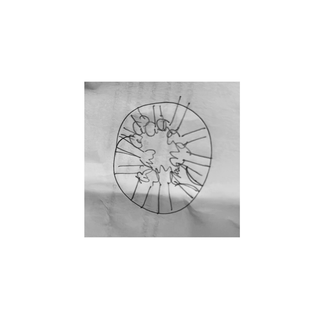
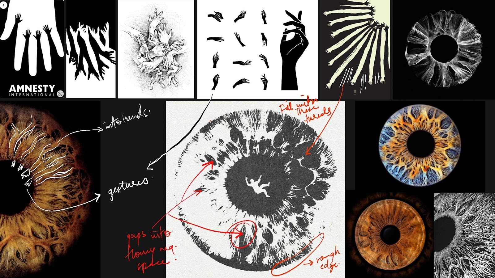
For the logo, he had a very clear vision: “A logo should look like a bunch of hands coming together to form an eye.” He even drew a quick sketch.

It was rough, but we got the idea — hands reaching from the edges, forming a pupil through negative space. A juxtaposition—vision shaped by those who create. It was an interesting direction, something that captured the essence of looking beyond the obvious.

These were the first three logo concepts that emerged.

(And of course, he didn’t like them)

Turns out, it wasn’t quite there. Something felt off—too static, too safe. The approach was clean and geometric, but it lacked the energy Radical Eyes stood for.

We were confused, maybe even frustrated. But Amitabh was patient. We got on a call, broke it down, and figured out what was missing.

The logo needed more than just balance—it needed movement, artistry, and intrigue. It had to spark curiosity, a conversation starter that revealed its details over time. Instead of making the hands obvious, they had to emerge subtly, a hidden surprise within the design. That’s what was missing.

So, back to the sketchbook. This time, we studied the intricate details of the eye—its depth, its texture, the way light interacts with it. An eye isn’t just a shape; it’s a work of art. All we had to do was interpret that art to carve out the hands.

This was the mood board we created for reference.

And that’s how it all came together :  
the hands, the depth, the movement,
shaping the final logo.

We took a more fluid approach. After analyzing countless references and breaking down their details, we saw an opportunity—the thin lines of the iris could become hands. Flowing like paint, they mimicked the natural intricacy of the eye. We also studied various hand gestures. Amitabh wanted them to feel like a team huddle—a symbol of planning and collaboration—yet they needed a sense of grace, not rigidity.

Website Design

The website for Radical Eyes needed to be more than just a portfolio—it had to position the brand as a serious international contender. It had to speak to two very different audiences: high-level corporate executives looking for efficiency and credibility, and young creative talent looking for inspiration and a sense of belonging.

To achieve this, we focused on clarity, confidence, and controlled boldness. The design had to be striking yet easy to navigate, modern but timeless. The approach was simple: strong typography, minimal color use, and subtle interactions to create a sense of motion without unnecessary clutter.

( Stylescape showcasing our vision for the site )

Key Design Elements

Bold yet simple – Type-led design that feels assertive and professional while staying readable.

Minimalist navigation – No distractions, just a clear and structured experience.

Affirmative, approachable copy – Short, confident sentences that reflect the brand’s personality.

Subtle interactions – Select headings and elements with motion for a modern touch.

Focused storytelling – A site that isn’t just a showcase, but a narrative of Radical Eyes’ vision and impact.

The Impact

We set out to give Radical Eyes an identity that felt as bold as its name—and safe to say, we delivered. The logo? It got love from Atlanta to Mumbai, turning heads and sparking conversations. The website? It did exactly what it needed to do—positioned Radical Eyes as a serious international player, spoke to both executives and creatives, and, just for good measure, landed us another client before we even had time to admire our own work.

By weaving together sharp storytelling, confident design, and just the right amount of attitude, we built a brand that feels as radical as the stories it tells. Now, when people see Radical Eyes, they don’t just see another production house—they see a vision.

Not bad for a rebrand, right?

The Impact

We don’t just design logos or build websites, we craft identities that demand attention and leave a mark.

If you're building something bold, something that deserves more than a generic brand, we’re here for it. We work best with brands that challenge norms, tell powerful stories, and aren’t afraid to stand out—whether you’re in film, design, tech, or something completely unexpected. If that sounds like you, let’s make something unforgettable.

Let’s talk.